Published Jan 17, 2023
Accessibility Testing with Assistiv Labs
In the digital world, accessibility is key to making sure that your website is usable by as many people as possible and that there are no barriers preventing access to or interaction with anything on your site. As a developer, a big part of this is thinking beyond just lines of code and considering the people you’re building for.
Picture this: you’re at a noisy pub waiting for your friends. While you’re waiting, you scroll through your social media feeds and come across an interesting video. However, the dialogue is drowned out by all the background noise. Rather than straining to catch the words, you activate the subtitles to ensure you can read the dialogue instead. In this scenario, you’re using assistive technology (subtitles) to overcome a situational disability (the noisy pub environment) to access the content you’re interested in.
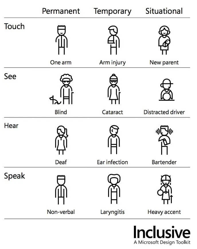
Accessibility is more than building for users with permanent disabilities. It’s about considering the diverse ways people interact with technology, whether it's through traditional screens, voice commands, or assistive technologies.
I was lucky enough to join Which? when a lot of the things I mention in this blog post were already being discussed. Having previously used Assistiv Labs, I was able to jump in and get involved straight-away, but I can’t take any credit for the work done by those most recently in procuring Assitiv Labs.
Assistiv Labs
At Which?, we’re taking steps to ensure that we’re confident in the accessibility of our code before deploying changes to production. To help us with this, we employ an aXe plugin integrated into our linter. Additionally, our toolkit includes Calibre, a tool that captures daily Lighthouse snapshots for select high-traffic pages.
While Voiceover is currently the main tool used for our manual testing, the WebAIM screen reader survey shows that it’s not very representative of the wider population. Considering that Windows is the predominant desktop operating system [1], and individuals with disabilities are more inclined to use Windows over Mac [2], the Accessibility Guild at Which? acknowledged the need for a better approach.
Enter Assistiv Labs! Assistiv Labs gives us access to a range of assistive technologies that would otherwise be unavailable or tricky for us to obtain. Having this wider range of technologies available for testing helps us make sure our website is accessible to as wide a range of users as possible, going beyond our previous testing methods.
Screen Readers
Screen readers are a crucial part of accessibility testing, offering insights into the experience of users relying on these technologies (although nothing beats user research with real users). Testing with one screen reader is better than nothing, but testing with more than one is even better. You’d be surprised how different one screen reader can be from another, something which my old team at Government Digital Service (GDS) are all too familiar with (example 1, example 2).
Having access to NVDA means we can now test our changes with one of the most popular screen readers [2], and in a Windows environment.
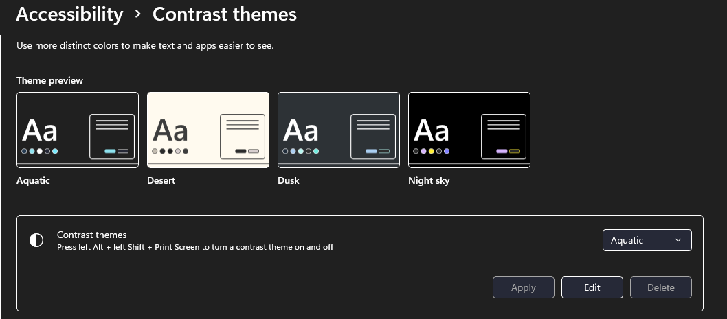
Forced Colours / High Contrast Mode
High contrast mode, or forced colours mode, is an accessibility feature that enhances the visibility of on-screen elements by increasing the colour contrast, typically by using a high-contrast colour scheme with a dark background and light text. While we remember to take colour contrast into account when building a colour palette or designing a new feature, we also need to make sure it works when colours are changed.
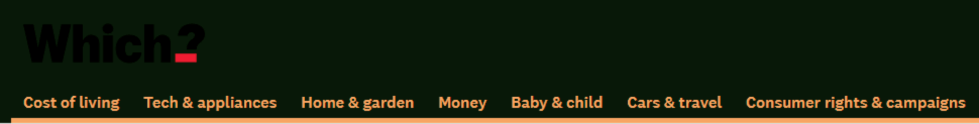
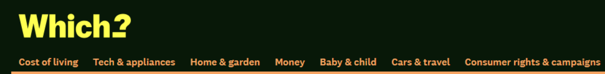
Testing with high contrast mode ensures that interaction states are clear and our content remains visible to users who rely on these settings. One of the first issues I spotted when testing the Which? site with high contrast mode was the visibility of the black logo against the dark background. This has now been fixed and, while in most cases, the main content on a Which? page is visible in high contrast mode, there’s still improvements we can make.
Reader Mode
Reader mode, first introduced in Safari and later adopted by others, is a feature designed to enhance the reading experience by stripping away extraneous elements from web pages. Reader mode simplifies the layout, removes ads, and focuses on presenting the main content in a clean and easily readable format. It is ideal for people seeking a distraction-free reading environment, those with attention difficulties, or individuals with visual impairments.
Reader mode is available in most browsers, so in that respect, Assistiv Labs doesn’t provide anything we don’t already have access to. However, when you’re already using Assistiv Labs to test with NVDA / Windows High Contrast mode, it serves as a good reminder, and it does enable us to check for differences between reader mode in Firefox/Edge on Mac vs Windows.
Animations
The ‘prefers-reduced-motion’ user preference setting [5] allows users to opt-out of animations and motion effects on websites. It’s useful for people who might experience discomfort or dizziness due to motion effects, or who might find animations distracting from the webpage content. We don’t make heavy use of animations at Which? so this isn’t something we need to consider regularly, but it’s a useful tool to have when needed.
Screen Magnification
Screen magnifiers, such as Windows Screen Magnifier, are designed to enlarge on-screen content for users with visual impairments. Unlike font-size or browser zoom functions, screen magnifiers enlarge the entire screen without any of the content reflowing.
It’s important to test changes with screen magnifiers to ensure that key information on the page remains visible. Things to look out for include:
- checking users are still able to use and read content inside tooltips
- ensuring form submission buttons are still visible or easily findable
- any text contained within images or charts is presented in text form elsewhere - this is important for other accessibility reasons too, but can also pose a problem for users of screen magnifiers
Putting it into practice
Accessibility is a collaborative effort, and at Which? the Accessibility Guild especially has been doing a lot of work to raise awareness of accessibility within our Product & Tech community and get the conversation going. This blog post was originally a lunch & learn session I ran when Assistiv Labs was first introduced at Which? last year. We’re still in the early stages of our journey and there’s a lot of work to do before it becomes a natural part of our day-to-day development, but we’re seeing positive signs, with more people considering accessibility in their work and getting involved in conversations about what we can do to improve.