Project: Siyan
Designer
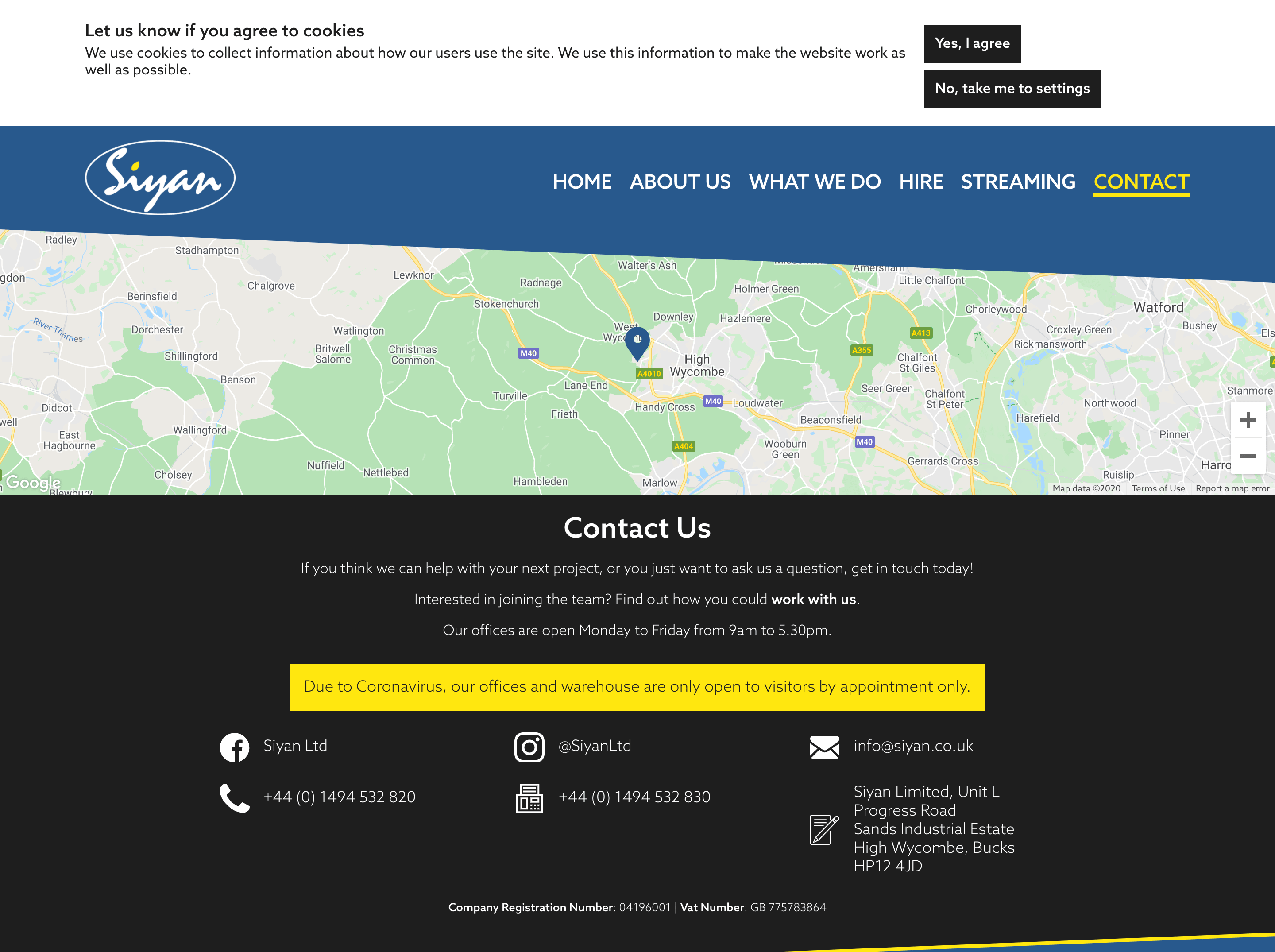
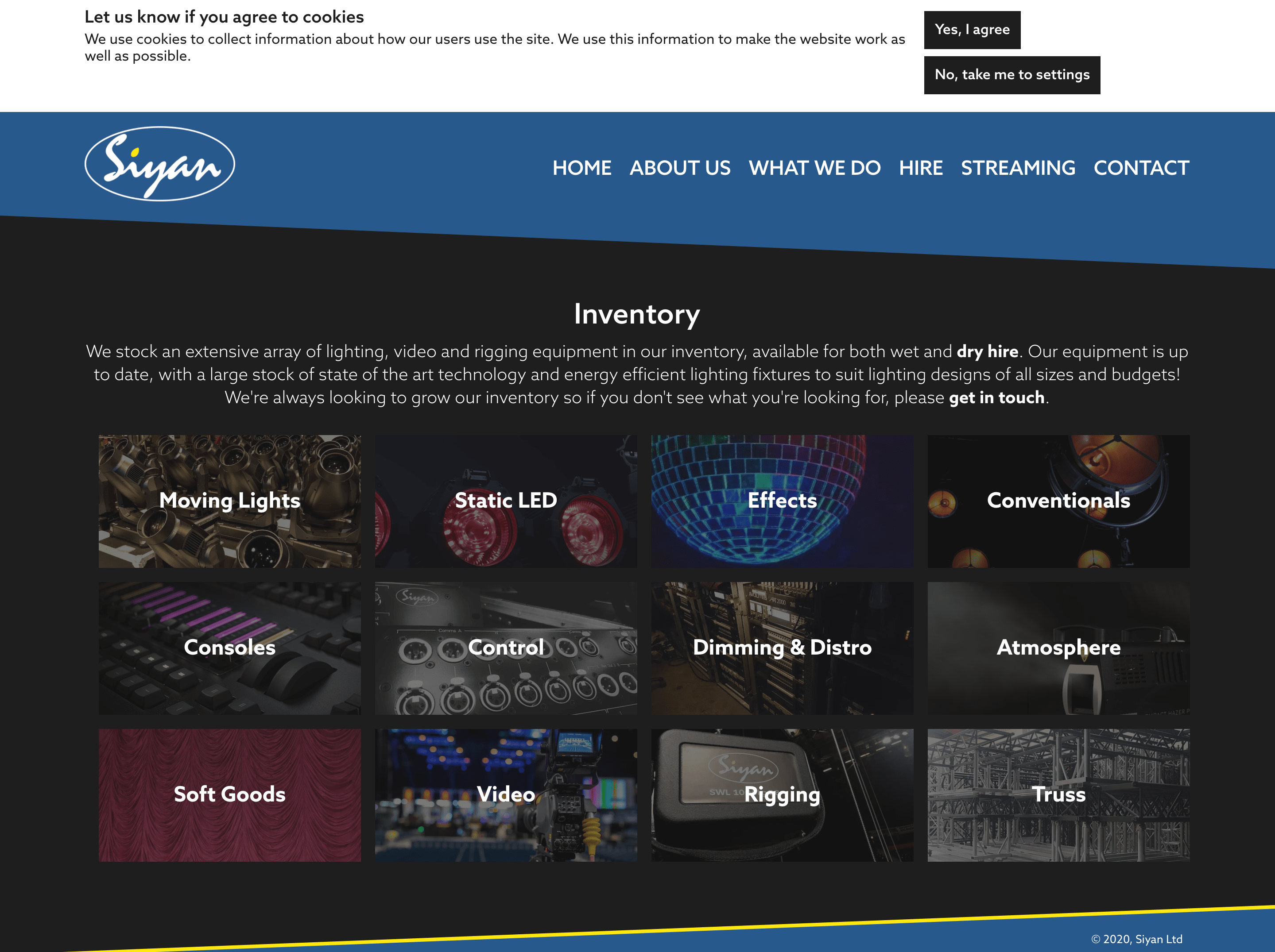
Siyan's existing website wasn't doing a good job of showcasing what the company do and the events they are involved in. On top of that, the website performed poorly from an accessibility point-of-view, with extremely low colour contrast that in places made the text impossible to read. With a logo and colour scheme, I created a site that better reflects Siyan's branding. Site developed by Andy Smith

